
Choosing a Dark Reader alternative: four approaches, compared on one page
People searching for a "Dark Reader alternative" rarely want the same thing. Some just find white backgrounds harsh. Some want true black for OLED battery. Some want the page to look better. Some are simply tired of images turning into negatives on certain sites.
This is not a ranking. It separates the four technical routes, because the route determines what can be solved — pick the wrong one and no amount of tuning will feel right.
How this was tested
- One page: cards, tables, inputs, a code block, and a layout that stresses glass effects
- One window: 1280×800, 100% zoom
- Only the scheme changes — same page, same system brightness
- Every screenshot is a real render, not a mock-up
Route 1: Dynamic remapping and inversion (Dark Reader, system dark mode)
This route usually gets called "inversion", but there are two different methods inside it, and they behave very differently.
Remapping is Dark Reader's default: it parses every CSS rule, works out each element's final background and text colour, maps those colours onto a dark range by luminance — backgrounds down, text up, hue preserved where possible — then injects an overriding stylesheet. Brand colours, icons and gradients survive; only the overall level drops.
Plain inversion is filter: invert(1) hue-rotate(180deg): flip the page, then flip images back on their own. Dark Reader's Filter mode and a number of other extensions take this path. It is the darkest result, but sections that were already dark turn into white blocks, and scrolling drops frames more readily.
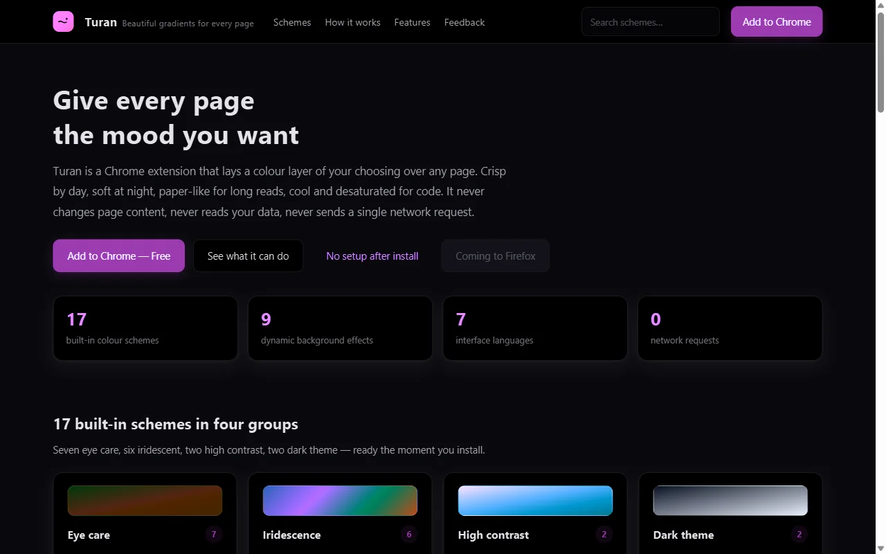 ⬆️ Turan's smart invert: full-page colour maths with hue preserved, images flipped back automatically
Strengths: genuinely dark; a dark page looks like a native dark app; on OLED there is a real battery argument. Costs: depends on the method. Remapping misreads canvas charts and components with hard-coded inline colours, sometimes needing manual fixes; plain inversion flips brand colours too, needs per-image repairs, and turns dark sections white. Best for: long night reading, system-wide dark preference, hard battery requirements.
Route 2: Injected CSS (Stylus and friends)
Write (or borrow) per-site CSS that changes background and text colours.
Strengths: maximum control — every pixel is yours. For a handful of sites you use daily, this is the best possible result. Costs: the cost is on you. Every site needs its own rules, redesigns break them, and you need to know CSS. Best for: people who live on a few sites and enjoy maintaining stylesheets.
Route 3: Multiply overlay (Turan, eye-care group)
No colour maths — a translucent colour layer composited with multiply.
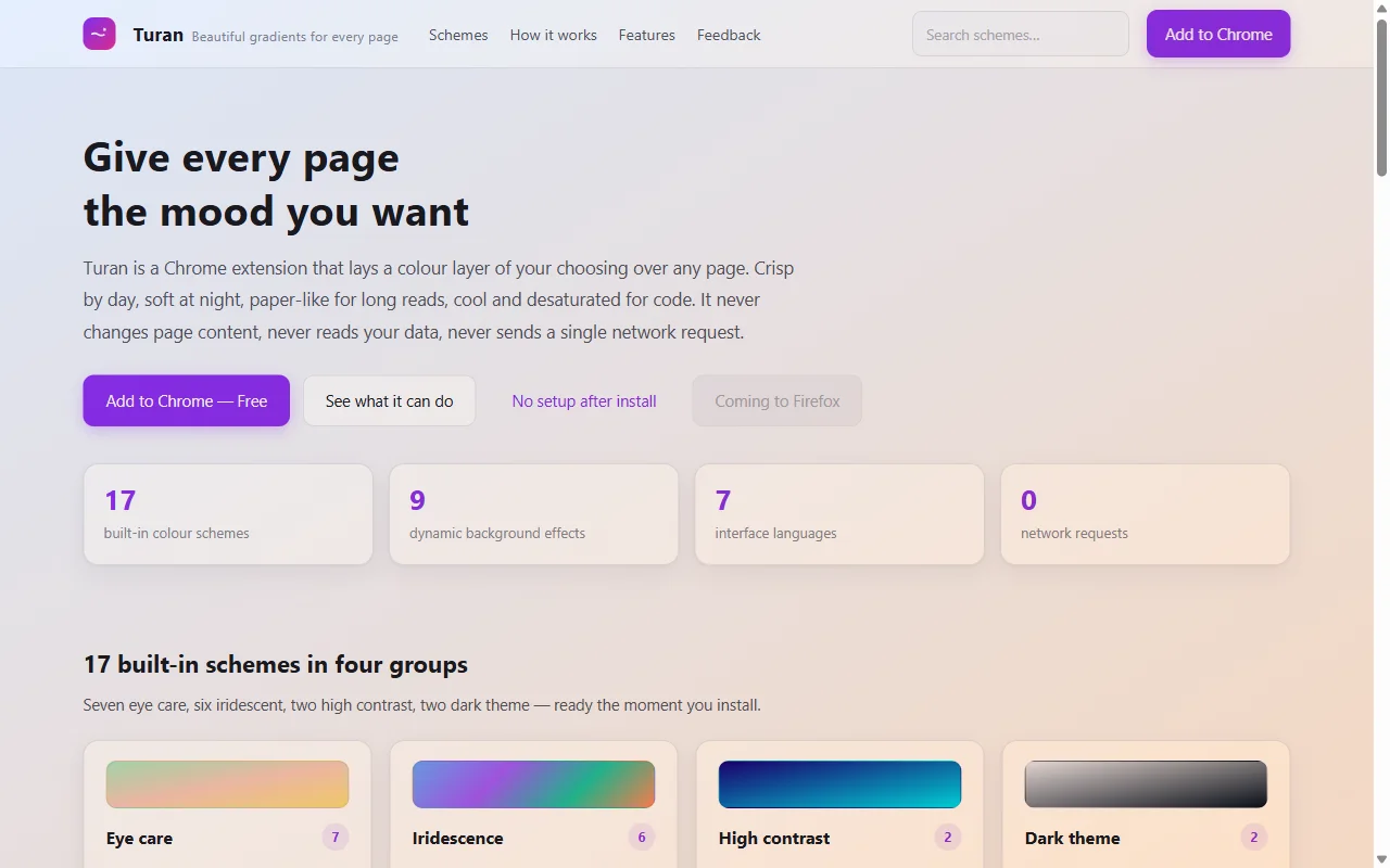 ⬆️ Dawn Eye Care: light backgrounds take the tint, dark text stays put
Strengths: no structural change, so no negative images; text contrast survives (measured 7.4:1); near-zero learning curve — drag a slider. Costs: it is tinting, not true black; on sites that are already dark, the tint is subtle. Best for: daytime work, long documents, anyone who just wants "less white".
There is also a solid-colour series, from low to high colour temperature: Soft Amber Night → Honey Dusk → Warm Paper → Sage Mist / Misty Veil.
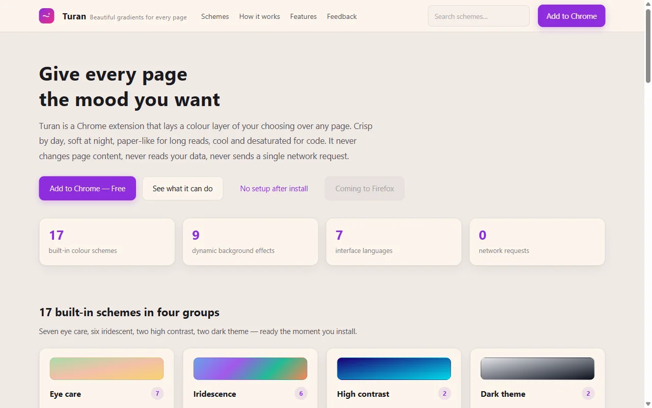 ⬆️ Warm Paper: cream paper feel, the most comfortable long-read option
Route 4: Frosted glass + motion (Turan, iridescence group)
This route does not solve glare. It solves "this page is boring".
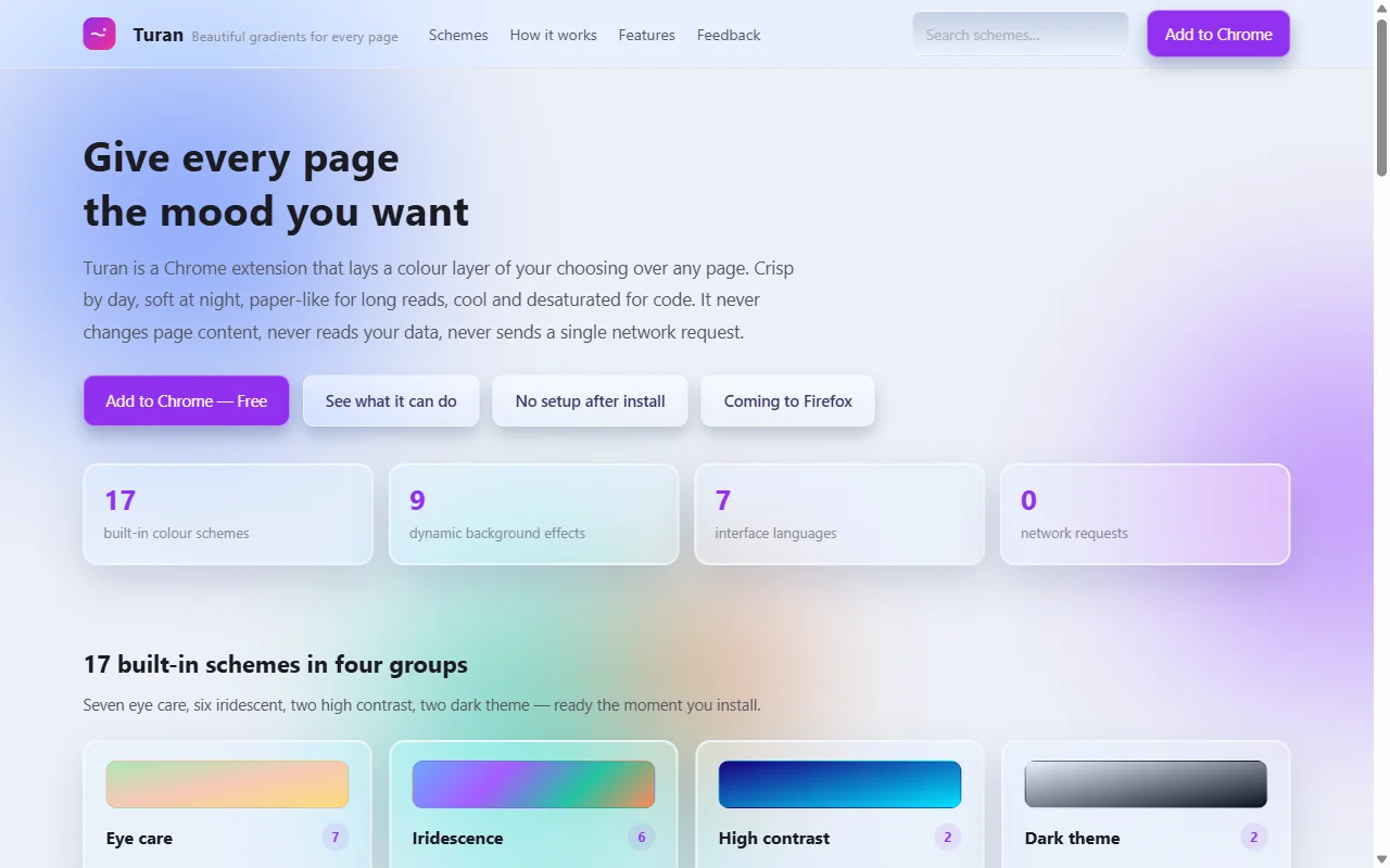 ⬆️ Iridescent Frosted Glass: panels become frosted glass over drifting colour blobs
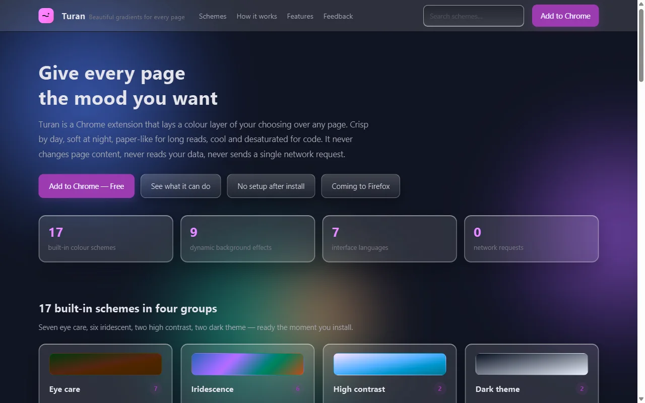 ⬆️ Obsidian Night: the dark variant, and the best-looking one at night
Strengths: almost nobody in the colour-extension space does this; cards, inputs and buttons really become glass rather than getting a filter; paired with an effect (stars, snow) the improvement is obvious. Costs: it changes the site's visual language, so admin tools and design portfolios may suffer; strength is fixed, so your only moves are stepping down (glass → no button FX → blobs only). Best for: personal browsing, blogs, news sites, "I want a different mood" days.
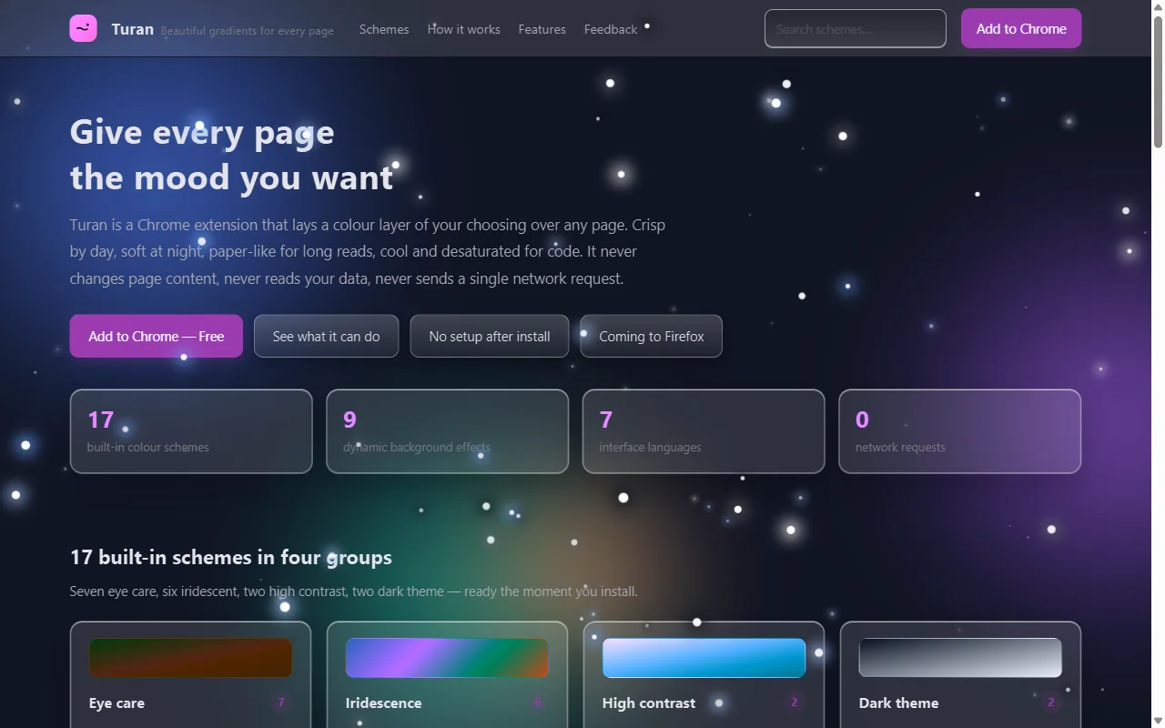 ⬆️ Obsidian Night + stars: effects and glass are independent switches — you can keep only the effect
Side by side
| Remapping / inversion | Injected CSS | Multiply | Glass + motion | |
|---|---|---|---|---|
| Makes white darker | ✅ thoroughly | ✅ depends on rules | ✅ gently | ✅ thoroughly (dark variant) |
| No negative images | ⚠️ per-site fixes | ✅ | ✅ | ✅ |
| Keeps site's own palette | ⚠️ remapping keeps hue, inversion flips all | ✅ | ✅ | ⚠️ reskins it |
| Usable without CSS | ✅ | ❌ | ✅ | ✅ |
| Per-site fine control | ⚠️ | ✅ best | ⚠️ one scheme per site | ⚠️ one scheme per site |
| Looks better | ❌ | ❌ | ⚠️ | ✅ |
| Data stays local | depends | ✅ | ✅ zero requests | ✅ zero requests |
How to choose: three questions
- Do you want "less glare" or "better looking"? The first is Dark Reader's remapping or multiply; the second is glass.
- Will you write CSS per site? If yes, Stylus. If not, use something turnkey.
- Do you care about browsing data? A scheme that stores and matches everything locally, with zero network requests, never has a "synced to the cloud" question to answer.
A common compromise: multiply by day (eye-care group), dark glass at night, whitelist the few sites that don't survive a reskin. You get the darkness of a dark scheme, the legibility of an overlay, and no CSS to maintain.
An honest boundary
If your core requirement is "save battery on OLED" or "one consistent dark system", Dark Reader's dark modes are still more thorough. If you need pixel-level customisation across dozens of sites, Stylus is still stronger. There is no universal colour tool — only the route that matches your situation.
Related reading