
Tired eyes after Chrome all day? Set up a comfortable scheme in 5 minutes
Most web pages are white background plus near-black text. Outdoors that is perfectly legible; four hours into an office day it becomes physical work. Turning the brightness down does not help much: it dims the whole picture at once, and the relationship between the white background and the dark text is unchanged. Your eyes are still working against a high-contrast white field.
What actually helps is tinting the background while leaving text contrast where it is. Below are four ways to do that, ordered by effort and by how good they look. Every screenshot is the same page at the same window size — only the scheme changes.
The short answer
| Situation | Scheme | Opacity |
|---|---|---|
| Daytime desk work | Green Field Warm Sun | 35% |
| Long reads / novels | Warm Paper | 45% |
| Late night | Soft Amber Night | 50% |
| You want a different mood | Iridescent Frosted Glass | fixed |
| Night, but nicer | Obsidian Night + Stars | fixed |
1. Warm overlay: the lowest-effort option
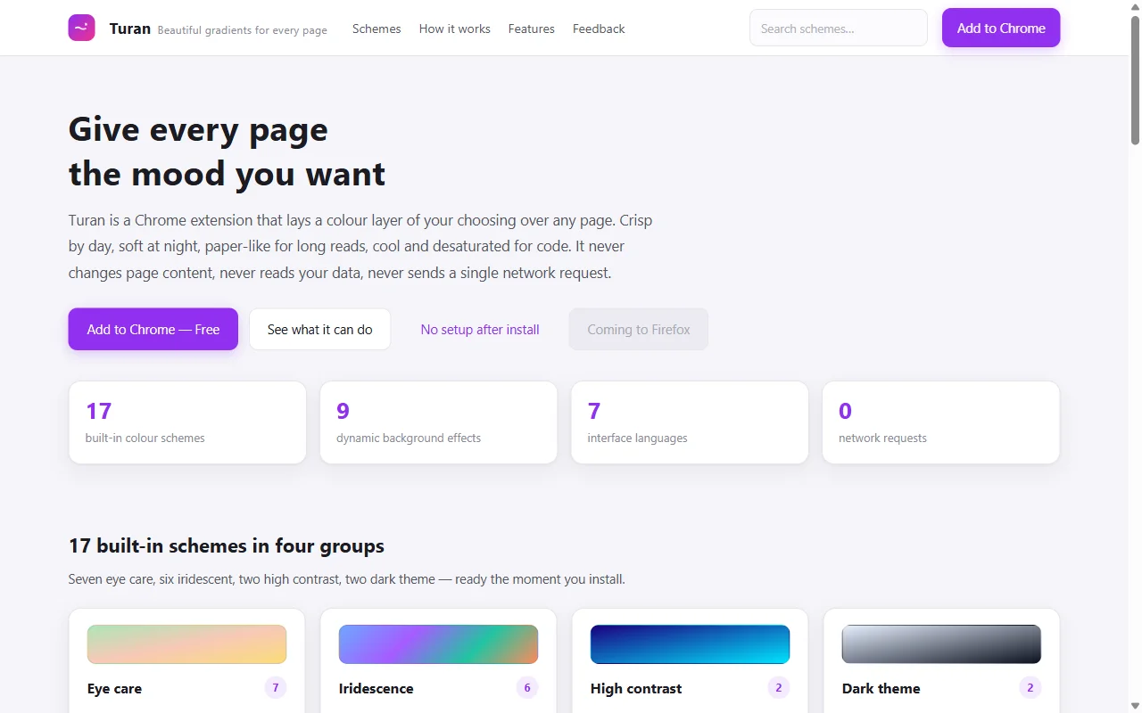 ⬆️ Untouched: white cards on light grey, dark body text — a textbook high-contrast setup
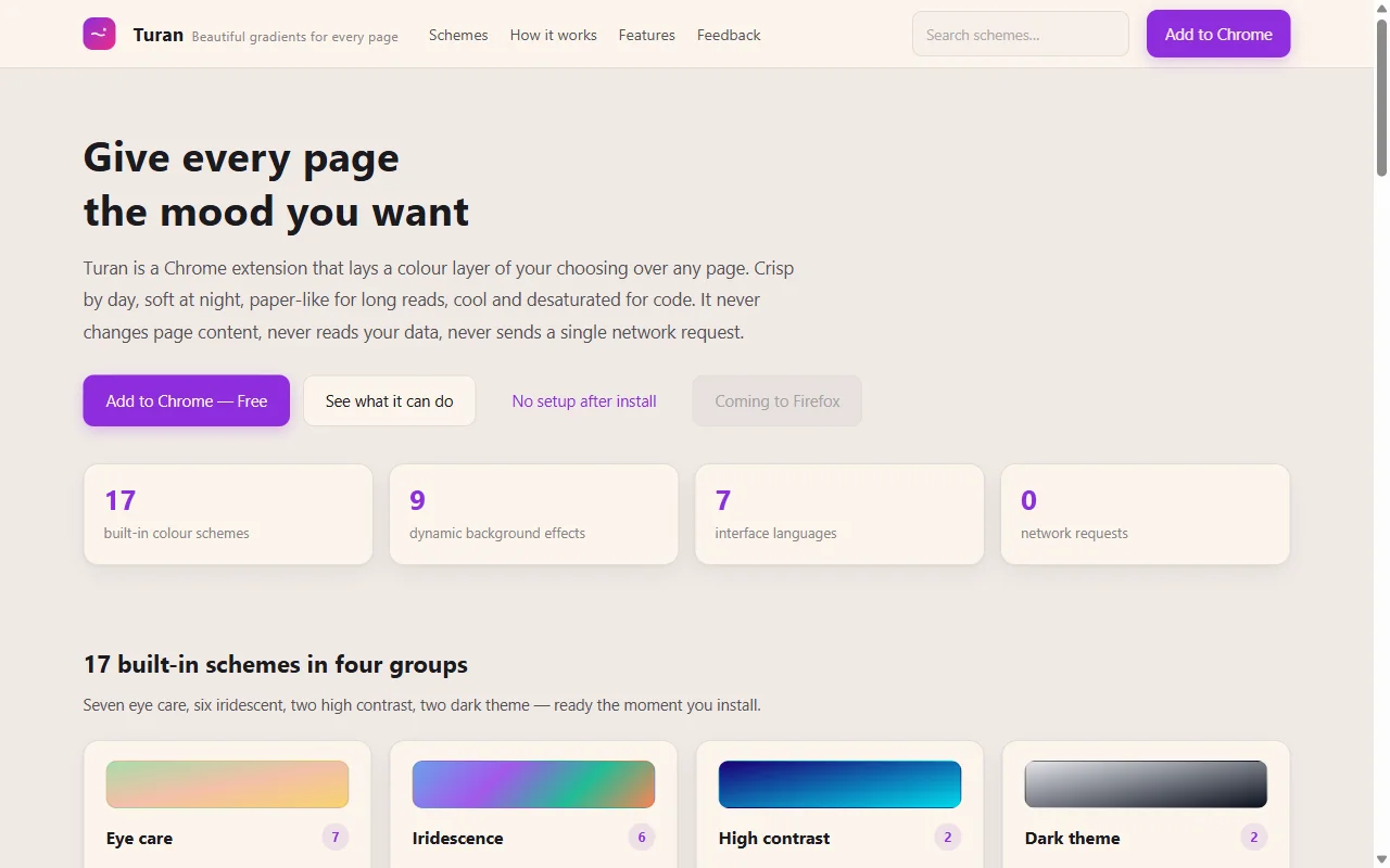 ⬆️ Warm Paper at 45%: the background turns cream, the text stays dark
The important part is how the colour is composited. Many "eye-care filters" simply drop a translucent layer on top — the text greys out with it, and two screens later you are tired again. Turan uses multiply blending: light backgrounds take the tint, dark text is left almost untouched. Measured body contrast is 7.4:1, still above the 4.5:1 that WCAG AA requires.
Three of the built-ins do most of the work:
- Warm Paper — cream paper tone, best for long text, novels, docs;
- Soft Amber Night — lower colour temperature, dims further, good for the last half hour in bed;
- Dawn Eye Care / Green Field Warm Sun — a little gradient, doesn't look dirty in daylight.
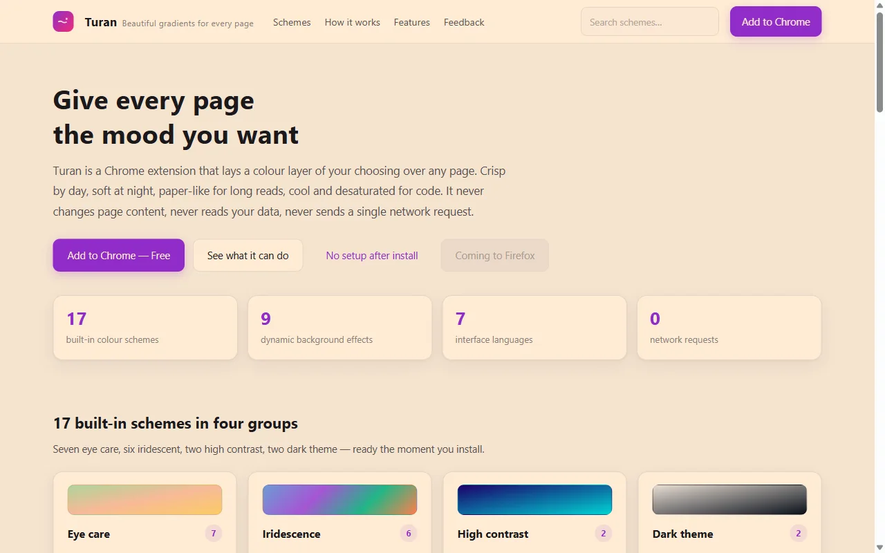 ⬆️ Soft Amber Night at 50%: lower colour temperature, no longer glaring at night
2. Light frosted glass: the best-looking option
If your goal is not eye care but simply wanting the page to feel different, light frosted glass is where this tool shines.
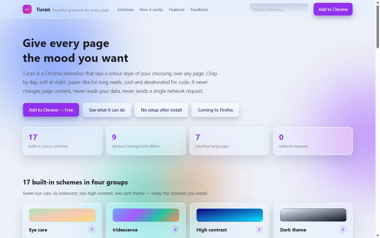 ⬆️ Iridescent Frosted Glass: panels, cards and inputs become frosted glass over slow-drifting colour blobs
It works differently from an overlay: it changes the material, not the colour. Cards, inputs and buttons become translucent glass; the page background carries four slowly drifting blobs that show through as you scroll.
If that is too much of a reskin — some admin panels become harder to scan — step down to the "No Button FX" variant: same blob background, but inputs, buttons and selects keep the site's original look.
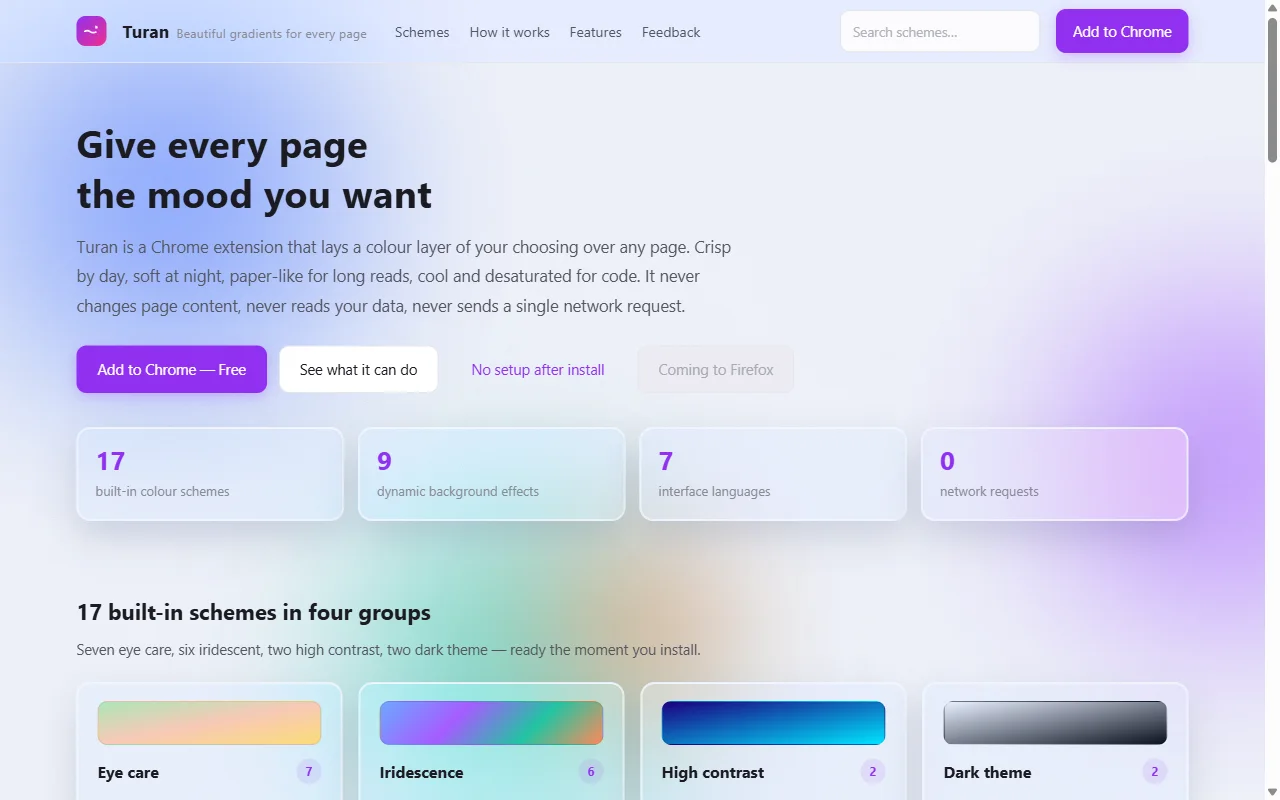 ⬆️ No Button FX: only the background changes, controls stay native
Opacity in this group is fixed, and the slider is disabled on purpose. The strength of the glass is set by the glass layer's blur and tint; stacking an overlay on top would only smear the text. To go lighter, step down a notch to the blob-only variant — background only, not even the panels change.
3. Dark glass and inversion: for the night
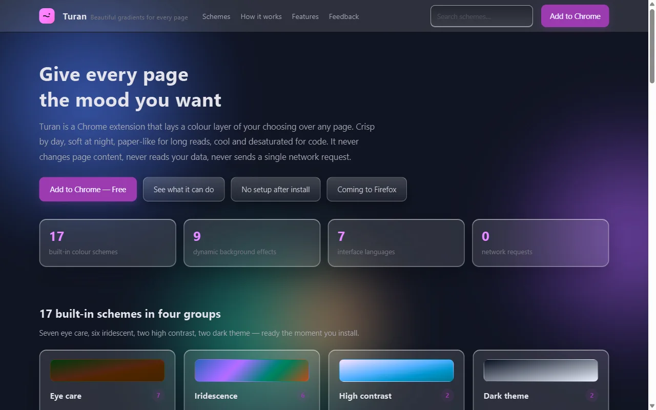 ⬆️ Obsidian Night: dark frosted glass, whole page dimmed, blobs drifting from violet to teal
Dark glass solves "too bright at night": the page is inverted and then covered with dark glass, so white no longer glares but cards keep their depth. It is gentler than a plain inversion — a plain inversion flips images, icons and highlights too. Dark glass dims and tints, which reads much closer to a native dark theme.
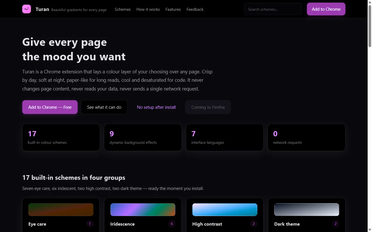 ⬆️ Smart invert: full-page inversion with hue preserved; images are flipped back
If all you need is "less bright", smart invert is more thorough. If you still want some colour character, pick Obsidian Night.
4. Adding an effect: the atmosphere step
Effects and colour schemes are two independent switches. The scheme makes the page comfortable; the effect makes it yours.
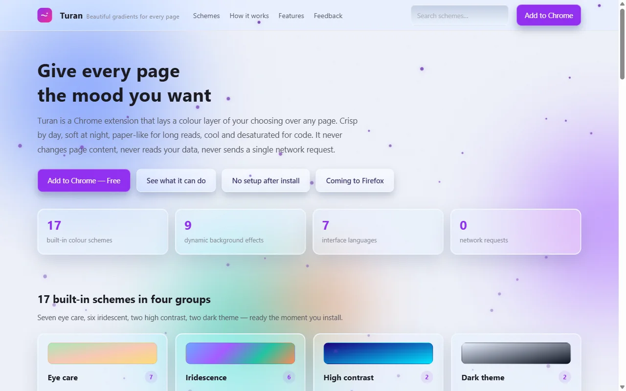 ⬆️ Frosted glass + snow: on a light page the flakes are violet, so they don't dissolve into white
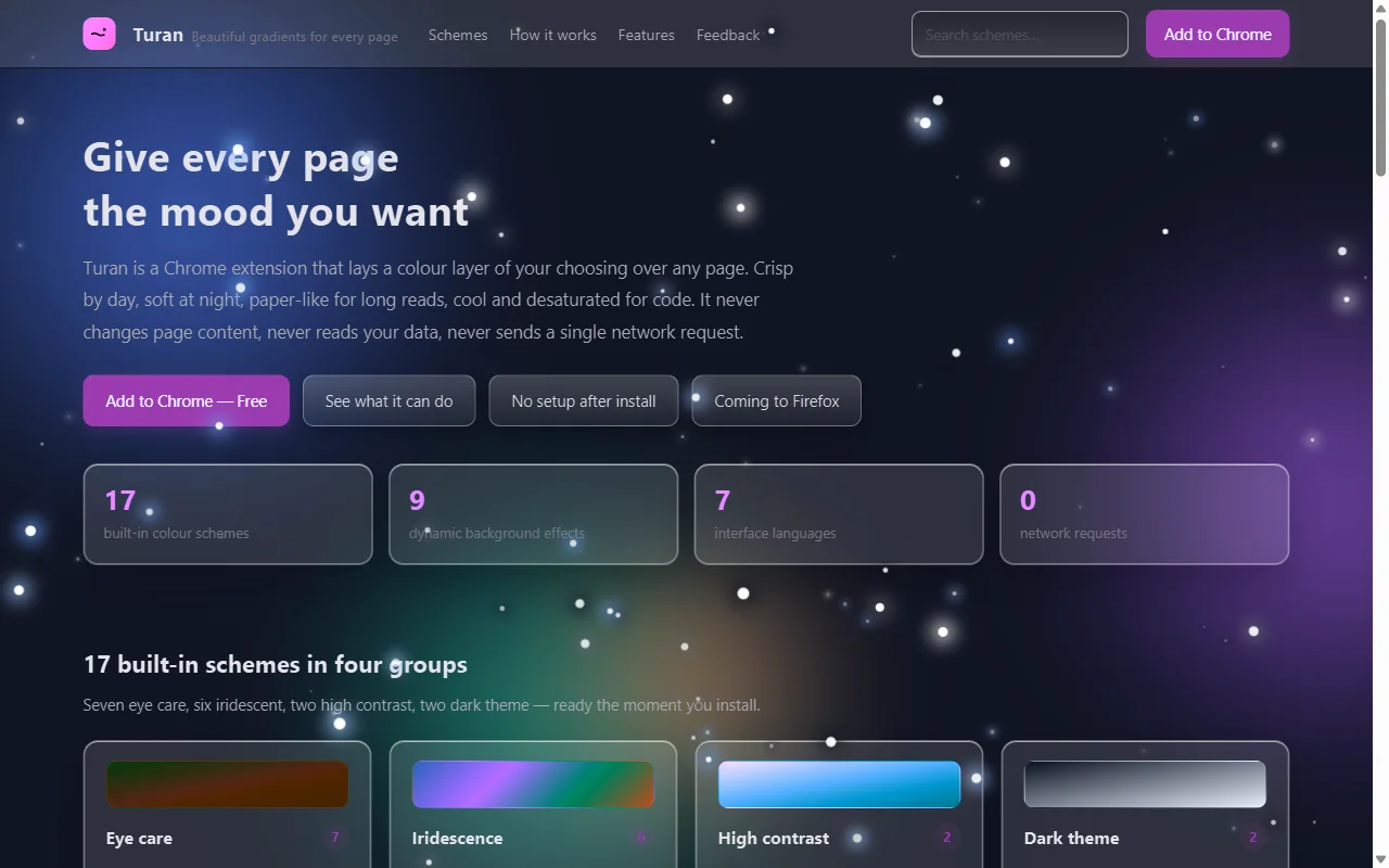 ⬆️ Obsidian Night + stars: the cleanest combination in the whole set
A few practical notes:
- Light pages pair best with snow, bubbles, leaves;
- Dark pages pair best with stars, meteors, fireflies;
- Fireworks look great but steal attention — don't use them while coding;
- Turning effects off really is zero cost; no background timer keeps running.
5. Set it up in three steps
- Install and go. Day (Green Field Warm Sun) and night (Dawn Eye Care) are already scheduled at 06:00 / 18:00.
- Click the toolbar icon. Pick a scheme, drag opacity, toggle effects — all in the popup.
- Open the full settings for the rest. Scheduling rules, per-site schemes and the whitelist live there.
The combination that survives a whole workday: Green Field Warm Sun 35% by day, Warm Paper 45% pinned to long-form sites, automatic switch to Dawn Eye Care at 18:00, and Soft Amber Night 50% by hand late at night.
6. Common traps
- More opacity is not better. Past 60% the text starts to grey out and you get tired faster; 30–60% is the measured comfort zone.
- The glass group's opacity slider doesn't move. That's by design: strength is baked into the glass layer. Step down to "No Button FX" or the blob-only variant instead.
- Dark themes invert the page. They are not a black veil, so images flip back automatically instead of turning into negatives.
- Don't use dark + snow in bright rooms. A dark background loses contrast in daylight, and moving flakes add distraction.
- Whitelist your admin tools. Forms are the first thing that gets harder to verify once tinted.
There is no universal answer here, but one test works well: ignore the promo image and read the first paragraph on your own screen. If three lines in you are not straining, it passes.
Related reading