
Turan vs Dark Reader vs Stylus: three technical routes, side by side
These three extensions get compared constantly, but they don't compete in the same ring. Dark Reader solves "too bright". Stylus solves "I'll write it myself". Turan solves "too bright, and I'd like it to look good too". Below, one page, one window size, only the scheme changes.
One-line conclusions
| Core method | Best for | |
|---|---|---|
| Dark Reader | Dynamic remapping (parses CSS, rebuilds dark styles) | Long night reading, true black |
| Stylus | Injected custom CSS | A few fixed sites, CSS-comfortable users |
| Turan | Multiply tint + frosted glass + effects | Daytime work, long reads, better looks |
1. Dynamic remapping: what Dark Reader actually does
"Dark Reader just inverts the whole page" is only a quarter true.
filter: invert(1) hue-rotate(180deg) was its approach in 2014. Today it survives as the Filter mode fallback: images have to be flipped back, sections that were already dark get turned white, and scrolling can drop frames.
The default Dynamic mode takes another path: it parses every CSS rule, works out each element's final background and text colour, then maps those colours back onto a dark range by luminance — backgrounds pushed down, text lifted, hue and saturation preserved where possible, contrast recalculated. The result is assembled into a .darkreader stylesheet and injected over the original. Images and SVGs aren't inverted, only dimmed.
What you get is a page that has been recoloured, not a page whose colours have been flipped. That's why it looks closer to a native dark theme than early inversion extensions did.
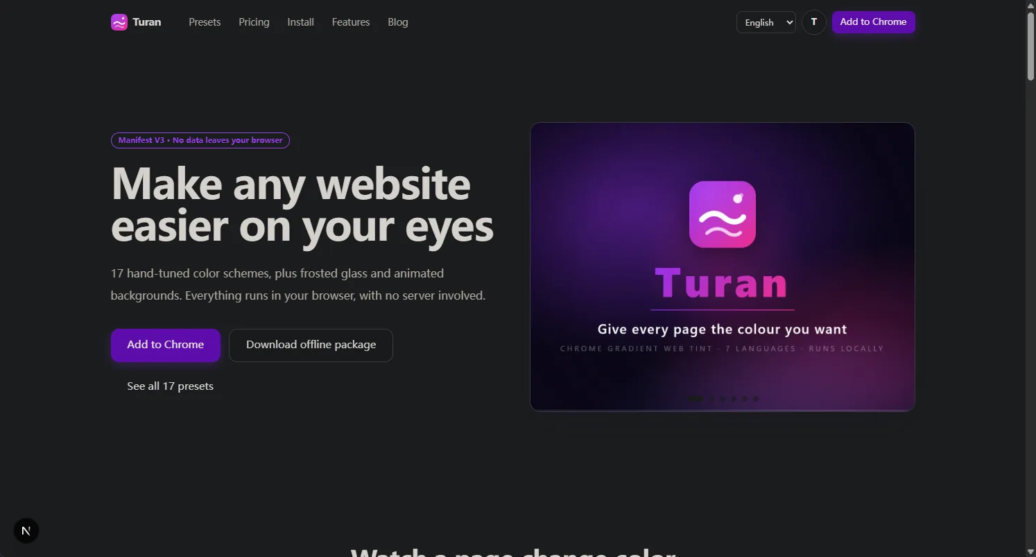 ⬆️ The same site under Dynamic mode: the brand purple and gradients are still there, just dimmed. True inversion would push them toward complementary colours
The costs are concrete too: per-element recalculation means canvas charts, components with hard-coded inline colours, and cards built from background images can all come out wrong — manual fixes or whitelisting, and slower first paint on rule-heavy pages.
Inversion hasn't gone anywhere — Turan's Smart Invert takes that route: whole-page colour maths, hue preserved, images flipped back. The difference from Dark Reader is "operate on every colour" versus "rebuild the stylesheet", not who is more advanced.
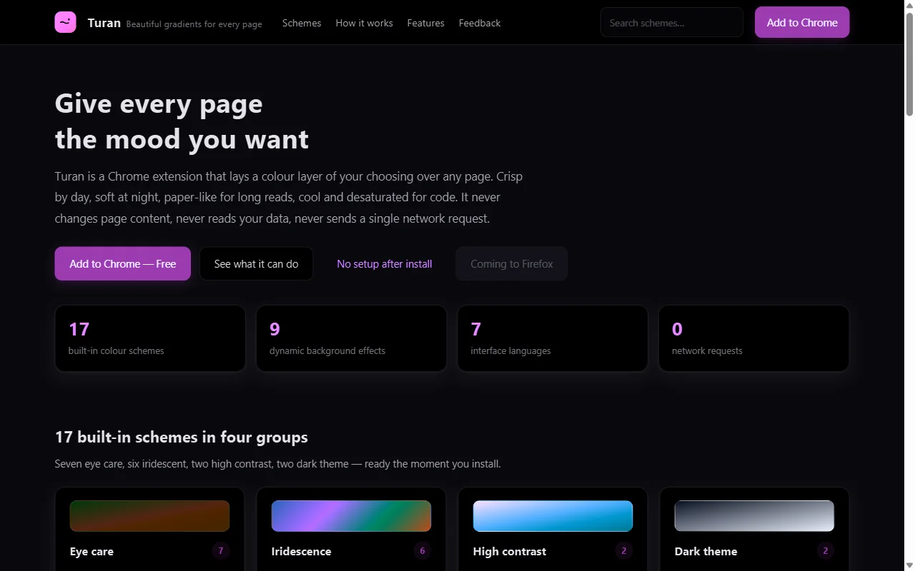 ⬆️ Turan's Smart Invert: whole-page inversion with hue preserved, images flipped back automatically
Inversion's real strength is that it is genuinely dark — the after-dark and OLED cases; its cost is that brand colours, button states and chart palettes flip along with everything else, and unsupported sites show white patches.
2. Injected CSS: maximum control, maximum maintenance
Stylus's model is "you write the rules". It reaches pixel precision, provided you maintain a stylesheet per site and keep fixing it after redesigns.
It answers "I know exactly what I want". If you merely find white harsh, writing CSS is a poor trade.
3. Multiply blending: pushing white down gently
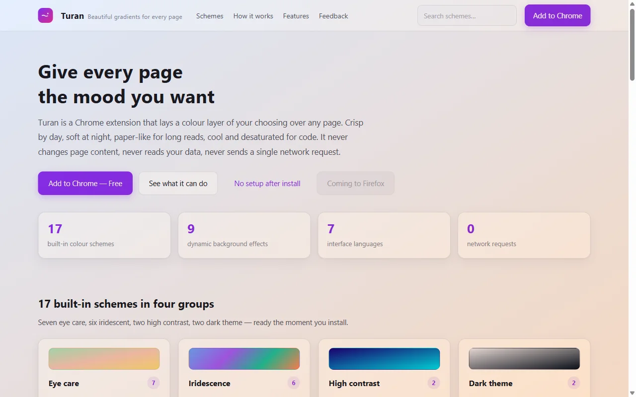 ⬆️ Dawn Eye Care: light backgrounds tinted, body contrast essentially unchanged
Turan's default route is multiply: white takes the colour, dark text stays put, measured body contrast 7.4:1 — still above WCAG AA. It will not give you true black, but it lands a good balance between dimming and readability.
The practical value is that you need to know nothing about CSS: drag an opacity slider and try anything between 30% and 60%.
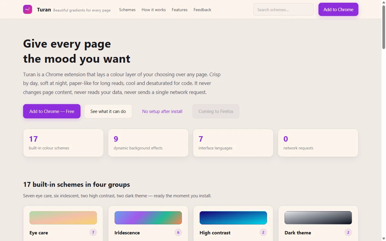 ⬆️ Warm Paper at 45%: the least tiring option for long text
4. Frosted glass: the option the other two don't have
This is Turan's actual differentiator, and the reason it isn't in the same ring as the other two.
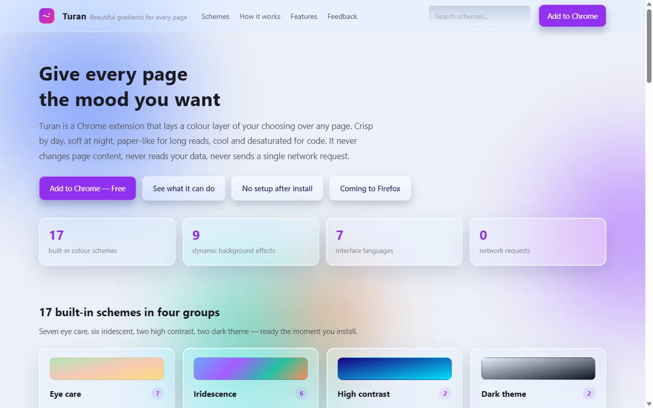 ⬆️ Iridescent Frosted Glass: cards, inputs and buttons really become frosted glass
It is not a translucent filter over the page — the elements themselves are turned to glass: cards gain depth, inputs get an inset highlight, the top bar becomes a floating frosted strip, and four colour blobs drift slowly behind everything. Scroll, and you see the blobs move behind the glass.
The dark variant is even more obvious:
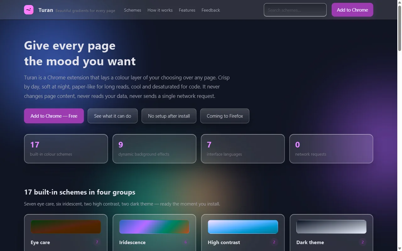 ⬆️ Obsidian Night: page dimmed, glass panels, blob background
When a reskin feels like too much, you can step down one notch at a time:
- Iridescent Frosted Glass — panels and controls both glassed;
- …(No Button FX) — blob background, controls untouched;
- Iridescent Blobs — background only, no element changes at all.
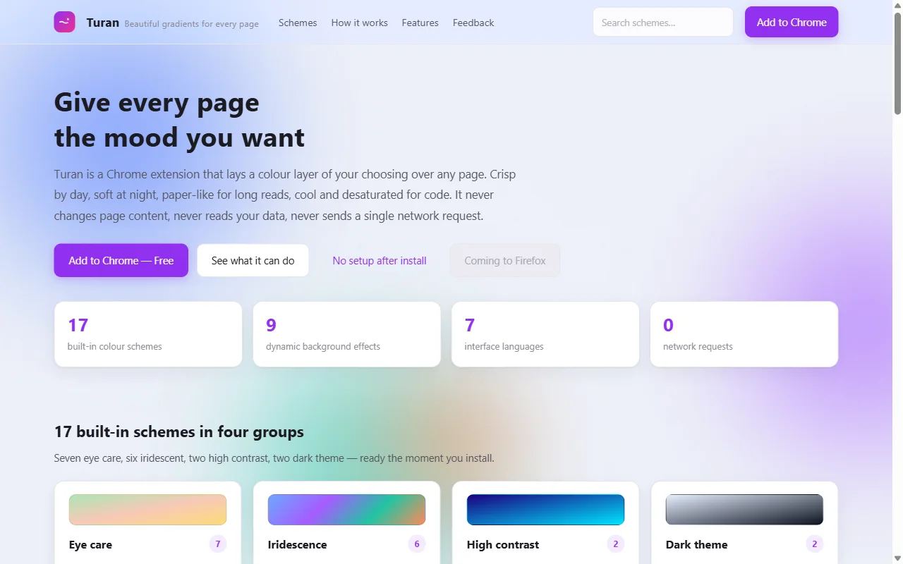 ⬆️ Iridescent Blobs: only the background changes; cards and controls keep the site's own look
5. Effects: atmosphere, not a feature
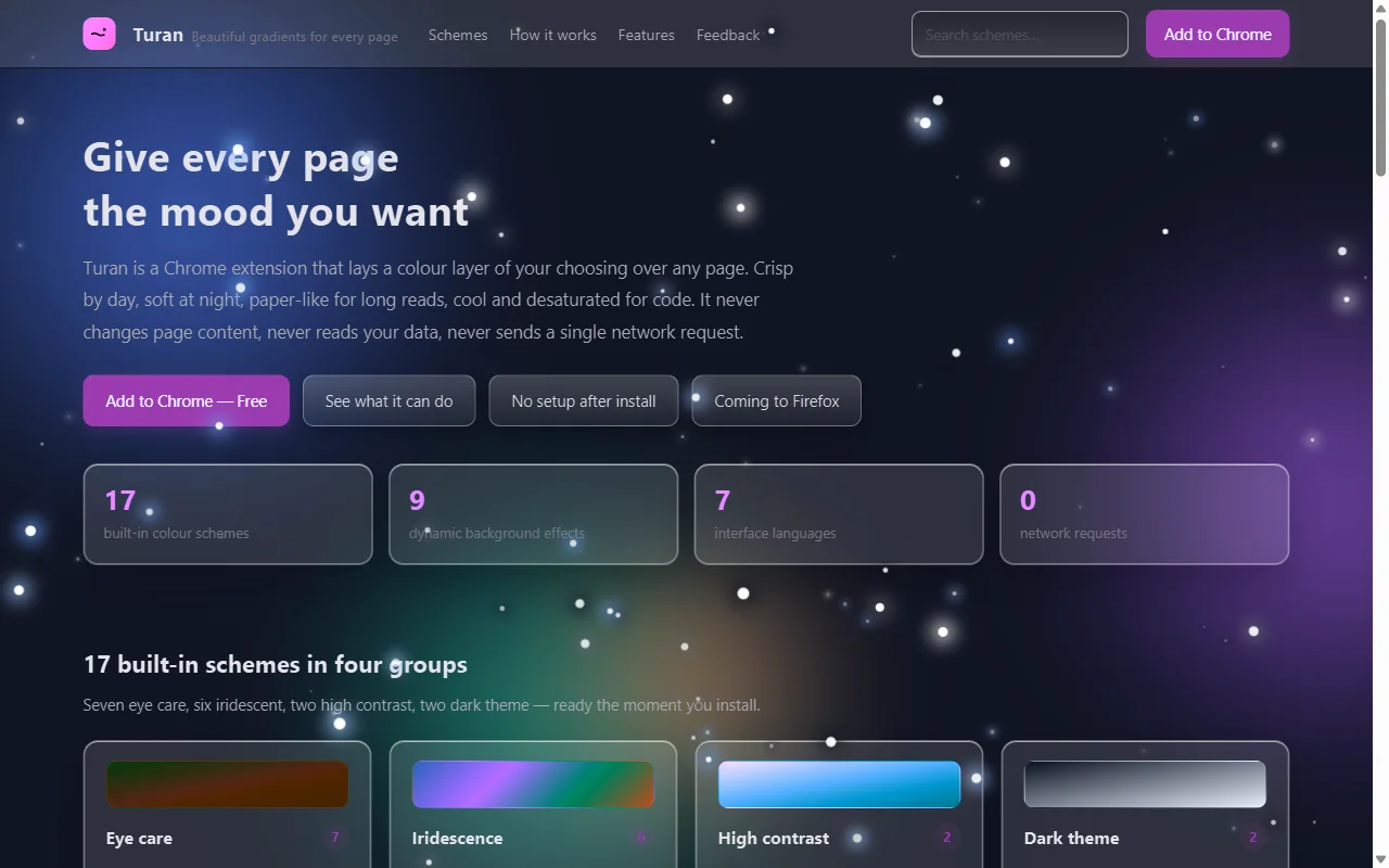 ⬆️ Obsidian Night + stars
Nine effects (stars, meteors, bubbles, snow, rain, fireflies, leaves, fireworks, grain) are pure CSS animation and cost nothing when off. Their role is narrow and clear: not a feature, but a mood. Skip fireworks while coding; leaves are right for a novel.
6. When not to pick Turan
Stating the boundaries is more useful than listing strengths:
- You want OLED battery savings — true black, go with Dark Reader's Dynamic mode or Turan's Smart Invert;
- You want pixel-level customisation — dozens of sites with unified fonts, spacing and radii; Stylus fits better;
- You live in heavy admin tools — glass can slow down form-checking; whitelist those sites, or stay on the blobs-only variant;
- You need cross-device sync — Turan's settings are local by design and never leave the machine.
7. A decision table
| Your situation | Suggestion |
|---|---|
| Desk work, white is harsh | Turan · Green Field Warm Sun 35% |
| Two hours of long reads a day | Turan · Warm Paper 45% |
| Browsing with the lights off | Turan · Obsidian Night, or Dark Reader |
| Three fixed sites, wants precision | Stylus |
| Wants the page to look better | Turan · Iridescent Frosted Glass + snow |
| System-wide dark preference | Built-in dark / Dark Reader, plus Turan for exceptions |
Finally
The three don't conflict. A realistic setup is: system dark mode on, Dark Reader for the stubborn sites, Stylus for the company intranet, and Turan for the part where you want the page to look good.
A tool's value isn't in replacing the others — it's in covering the slice they can't. For Turan that slice is: readable and good-looking, without writing a line of CSS.
Related reading