
How to pick from the 17 built-in schemes
Turan ships 17 colour schemes in four groups. This page helps you choose one in a single pass.
Turan ships 17 colour schemes in four groups. This page helps you choose one in a single pass.
| Group | Count | In one line |
|---|---|---|
| Eye care | 7 | The default choice for long reading; soft and low-saturation |
| Iridescent | 6 | Frosted glass and blobs; looks first |
| Dark | 2 | The whole page goes dark, for night use |
| High contrast | 2 | Strong colour, best in short bursts |
1. Eye care, 7 schemes: the everyday pick
| Scheme | Look | Best for |
|---|---|---|
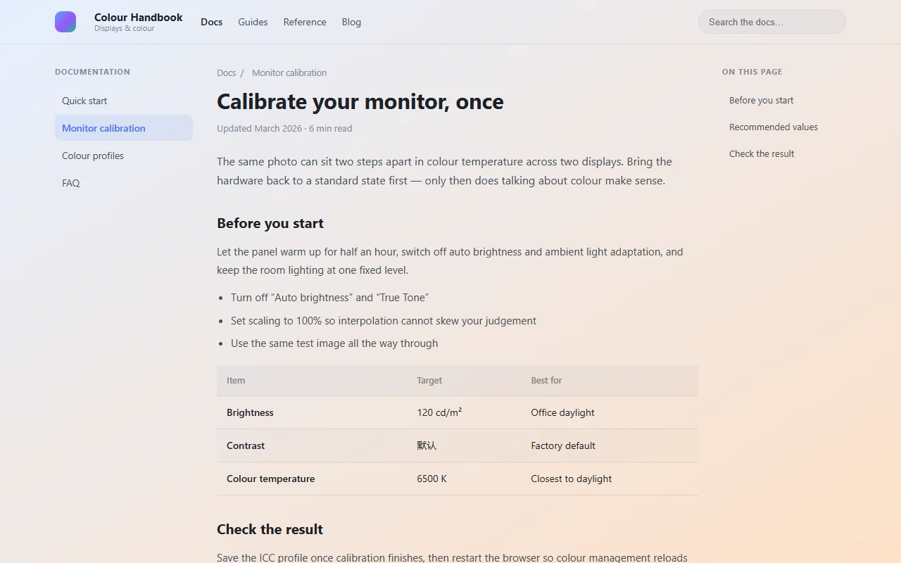
| Dawn Eye Care | Blue-to-orange gradient, like early morning light | All-round use; the default night scheme |
| Green Field Warm Sun | Three-stop gradient: green → peach → warm yellow | Daytime; the default day scheme |
| Warm Paper | Cream paper tone | Long articles, novels |
| Honey Dusk | Warm amber | Early evening, warm without glare |
| Soft Amber Night | Dimmed soft amber | Late night |
| Sage Mist | Pale matcha green | When you want to feel awake without a cold cast |
| Misty Veil | A very light grey-blue white | When you want a change that is barely noticeable |
Dawn Eye Care
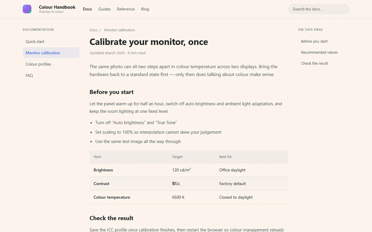 Warm Paper
If you cannot decide, start with Dawn Eye Care, then fine-tune the opacity as described further down.
2. Iridescent, 6 schemes: frosted glass and blobs
This group does not use a gradient overlay; it changes how the page itself looks.
| Scheme | Effect |
|---|---|
| Iridescent Frosted Glass | Panels, cards and controls all become frosted glass, with colour blobs behind them |
| Iridescent Frosted Glass (No Button FX) | Frosted blobs in the background, but inputs, buttons and selects keep the site's native look |
| Iridescent Blobs | Background only: four colour blobs drift slowly, no page element is touched |
| Obsidian Night | The dark version of the frosted glass; the page is dimmed overall |
| Obsidian Night (No Button FX) | Dark blob background with native controls preserved |
| Obsidian Blobs | Dark blob background, page elements untouched |
"No Button FX" versus "Blobs": the first still turns panels into glass, the second does not touch panels at all and only swaps the background. If a site feels over-restyled, step down to the latter.
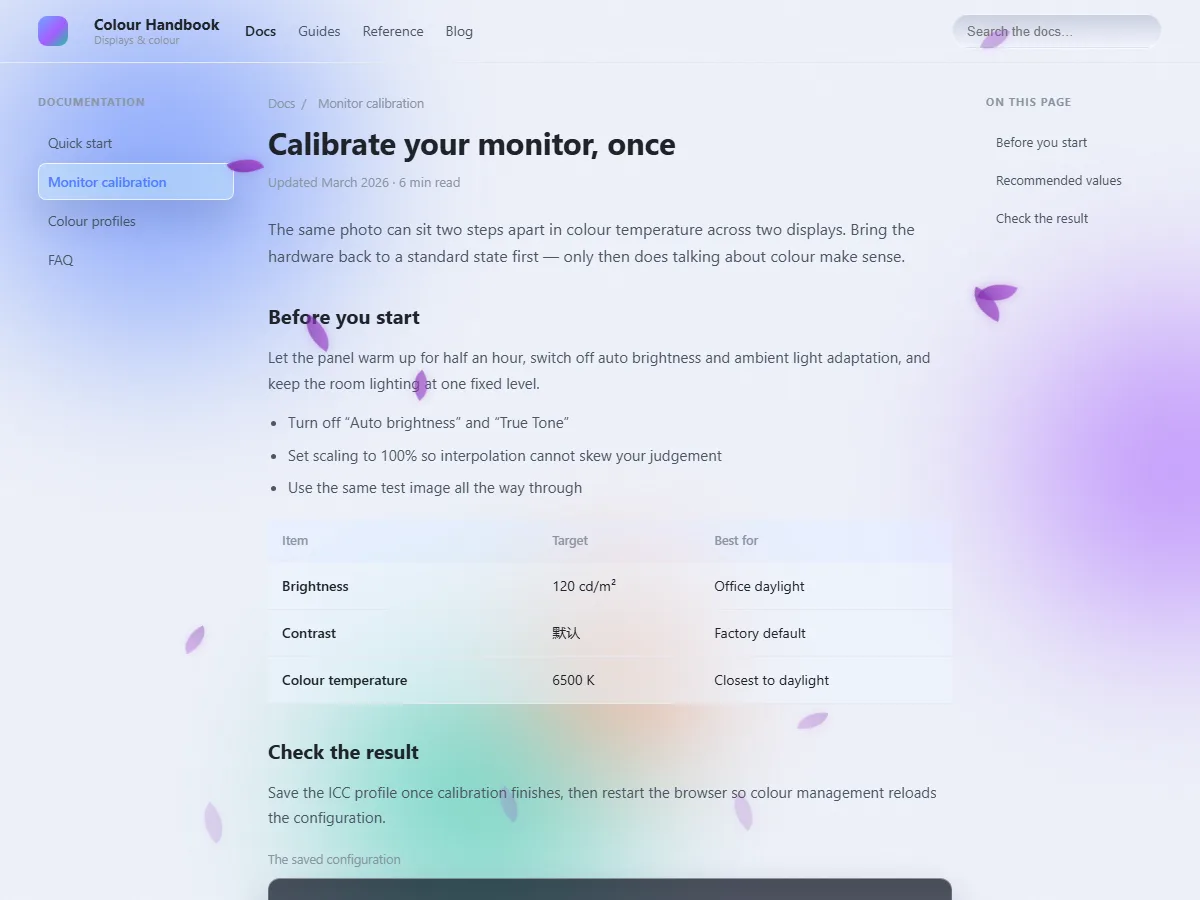 Iridescent Frosted Glass
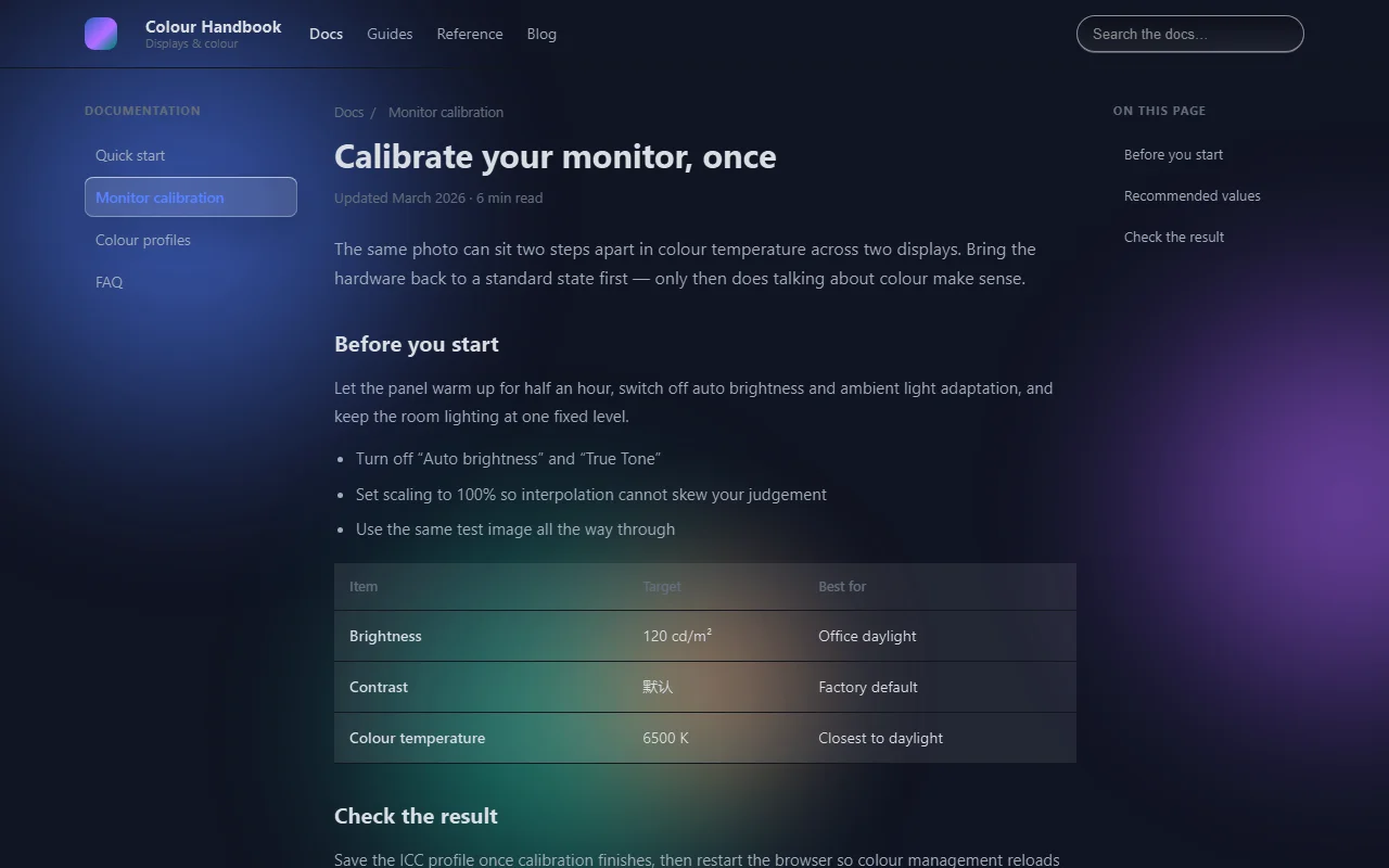 Obsidian Night
3. Dark, 2 schemes
These two darken the whole page by inverting it rather than laying a translucent black veil over it — which is exactly why the text stays legible.
| Scheme | How it works | Character |
|---|---|---|
| Smart invert | Inversion plus a hue rotation | Whitish pages go dark while some of the original hue survives, so the result looks natural |
| Invert overlay | White overlay plus difference blending | Precise inversion, black and white stay distinct |
Both work best at night. Note: with the dark schemes, opacity is not part of the effect.
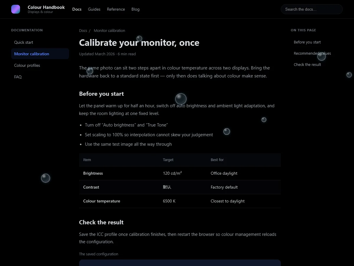 Smart invert
4. High contrast, 2 schemes
| Scheme | Look |
|---|---|
| Cyber Blue | Deep indigo purple → bright cyan |
| Golden Sunset | Dark red → golden orange |
Heavy on colour and hard to miss — good for short bursts or when you want a strong look, not recommended for long reading.
How it works: multiply tinting
Turan composites its gradient through multiply blending. In plain terms:
- Light backgrounds → take on the tint
- Dark text → barely affected, stays legible
So you get "tinted background, clear text" rather than the usual "veil over everything, text greys out with it". Measured body contrast is 7.4:1, above the 4.5:1 that WCAG AA requires.
This is also why Turan does not offer a "blend mode" selector: multiply turned out to be the only option that keeps both colour and readability, so it is fixed.
Adjusting opacity
- Range 0–100%, default 30%
- 30–60% is the sweet spot: below 30% you hardly see anything, above 60% the background gets heavy
- The slider supports mouse-wheel nudging; hold Shift for larger steps
- The settings page has a live preview, so you can watch the result while dragging instead of switching back to the page
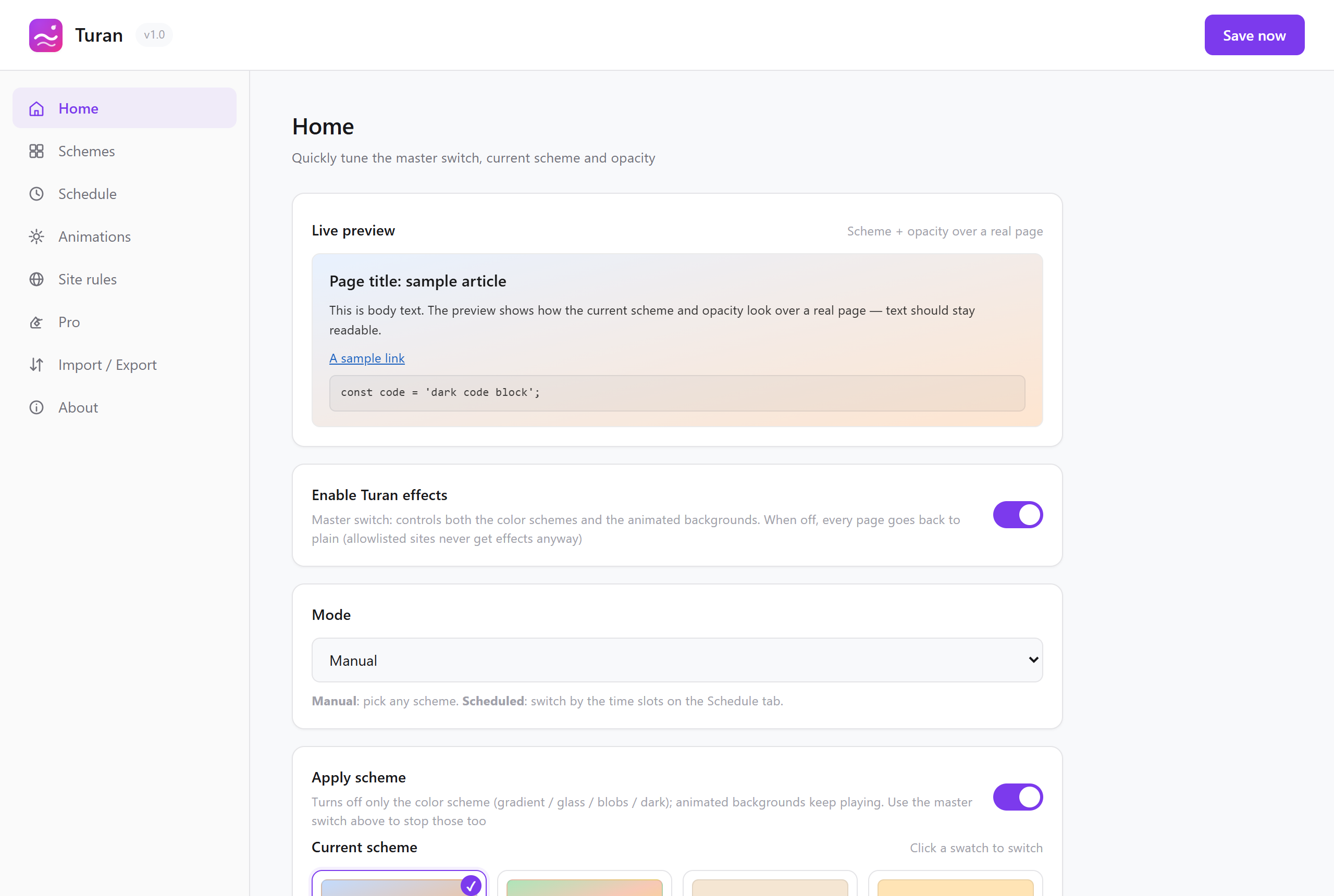 The live preview card on the settings home page
Why opacity is greyed out for the iridescent group
The strength of the frosted glass and blob schemes is fixed by their spec (75% opacity blobs plus a 60px blur) and does not read the opacity setting. Rather than let you drag a slider that does nothing, it is disabled on purpose.
To make the overall effect stronger or weaker, switch schemes or change the blob colours.
Decision table: pick one in 30 seconds
| Your situation | Go with |
|---|---|
| Not sure, just trying | Dawn Eye Care at 40% |
| Daytime desk work, documents | Green Field Warm Sun at 35% |
| Novels, long articles | Warm Paper at 45% |
| Evening into the night | Honey Dusk / Soft Amber Night at 40% |
| Some character, but not distracting | Misty Veil at 30% |
| You want the effect to be obvious | Iridescent Frosted Glass / Iridescent Blobs |
| Bright screens hurt at night | Obsidian Night / Smart invert |
| Only on one particular site | Bind it with a per-site scheme |
Read next